PocketChef
Project
Countless recipes at your fingertips.
As I began my journey with the Google UX Design Course, I had a dream about making a simple, intuitive cookbook that can record all my favorite recipes and come back to the core saying: “you eat with your eyes first” - a basic concept in food where you visually captivate your audience when presenting your culinary art.
ROLE
UX Designer & Researcher
(User Research, Visual Design & Conceptualization, Wireframes, Prototyping & AB Testing)
TEAM SIZE
1
INDUSTRY
Health & Wellness, Food & Drink
TIMELINE
Q1 2021 - Q3 2021
TOOLS
Figma, Miro, Adobe Illustrator & InDesign
PRODUCTS
PocketChef Cookbook App
Analysis & Survey
I wanted to understand how users were feeling about current applications on the market, and what kind of features would benefit their lifestyles. I went to the web to review some of the cookbook apps that were being featured and conducted a competitive analysis on the reviews to see what users were saying about the software, evaluating positive, neutral, and negative comments.
After synthesizing the data, I created an additional survey around the results and requested feedback from 50 users, with 23 completed surveys. I wanted to see if the reviews of the existing apps matched what my target audience was also experiencing. I found the following to be true:
Users with busy lifestyles can’t commit large amounts of time to cooking.
Unsatisfying images from various recipes make users give up on recipes.
Many apps are “jam-packed” with features that are irrelevant to the users’ end goals, making navigation frustrating and overwhelming.
So, let’s create simple recipes that are delicious, quick, and easy to navigate.
Ideation

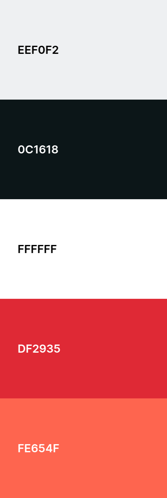
I knew I wanted to include colors that would relate to food and excite appetites. When it comes to color psychology around food, I found that red drove energy and excitement in foods and brands.
When it comes to food, some may get excited about the idea of red meat, juicy tomatoes and sauce on pizzas, and maybe even something fresh like strawberries or raspberries — the fact is, red exists in a lot of our daily foods.
Brands also use this color to drive some excitement. You may find familiars like McDonald’s, KFC, Heinz, and Chili’s, among others, that are utilizing a red color palette to drive their brand.
Colors
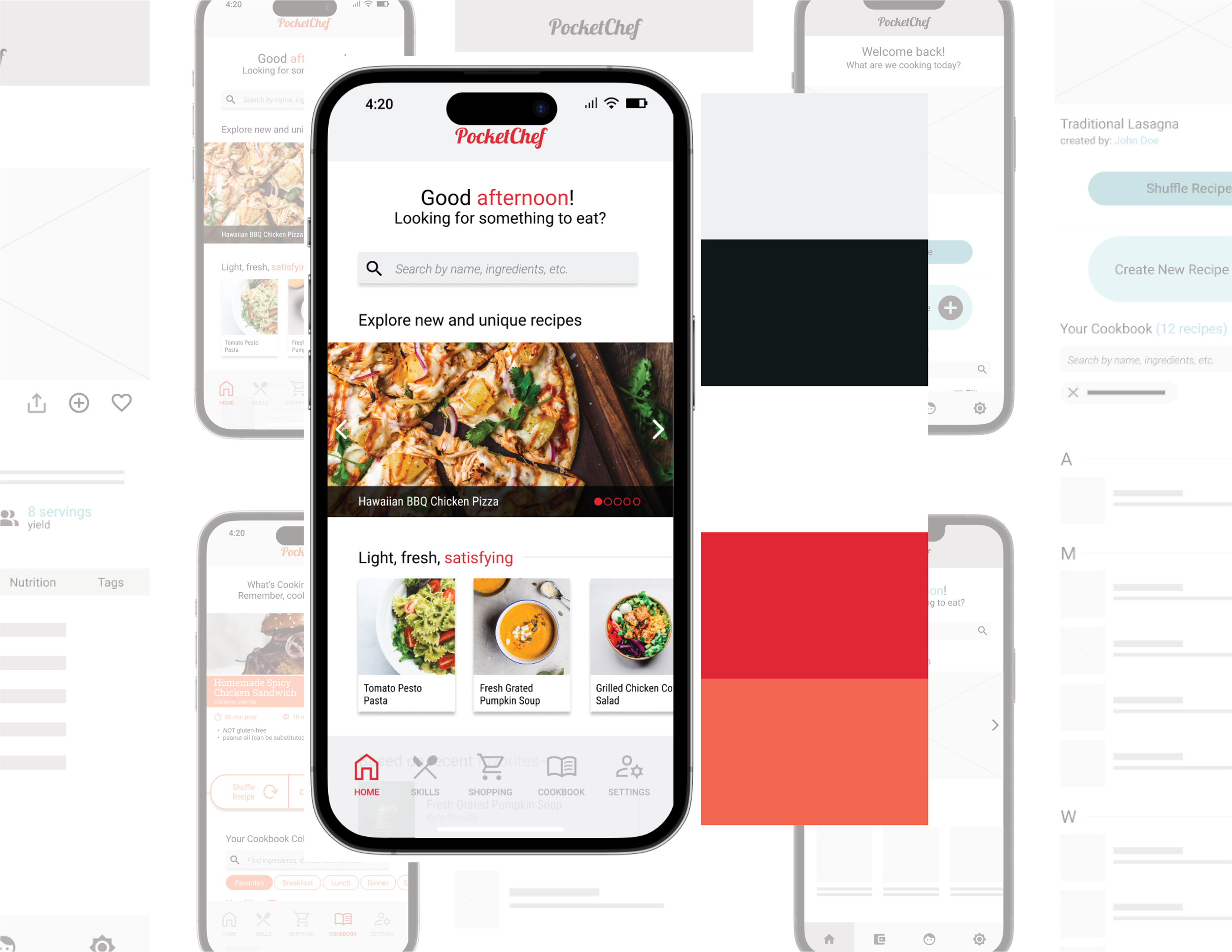
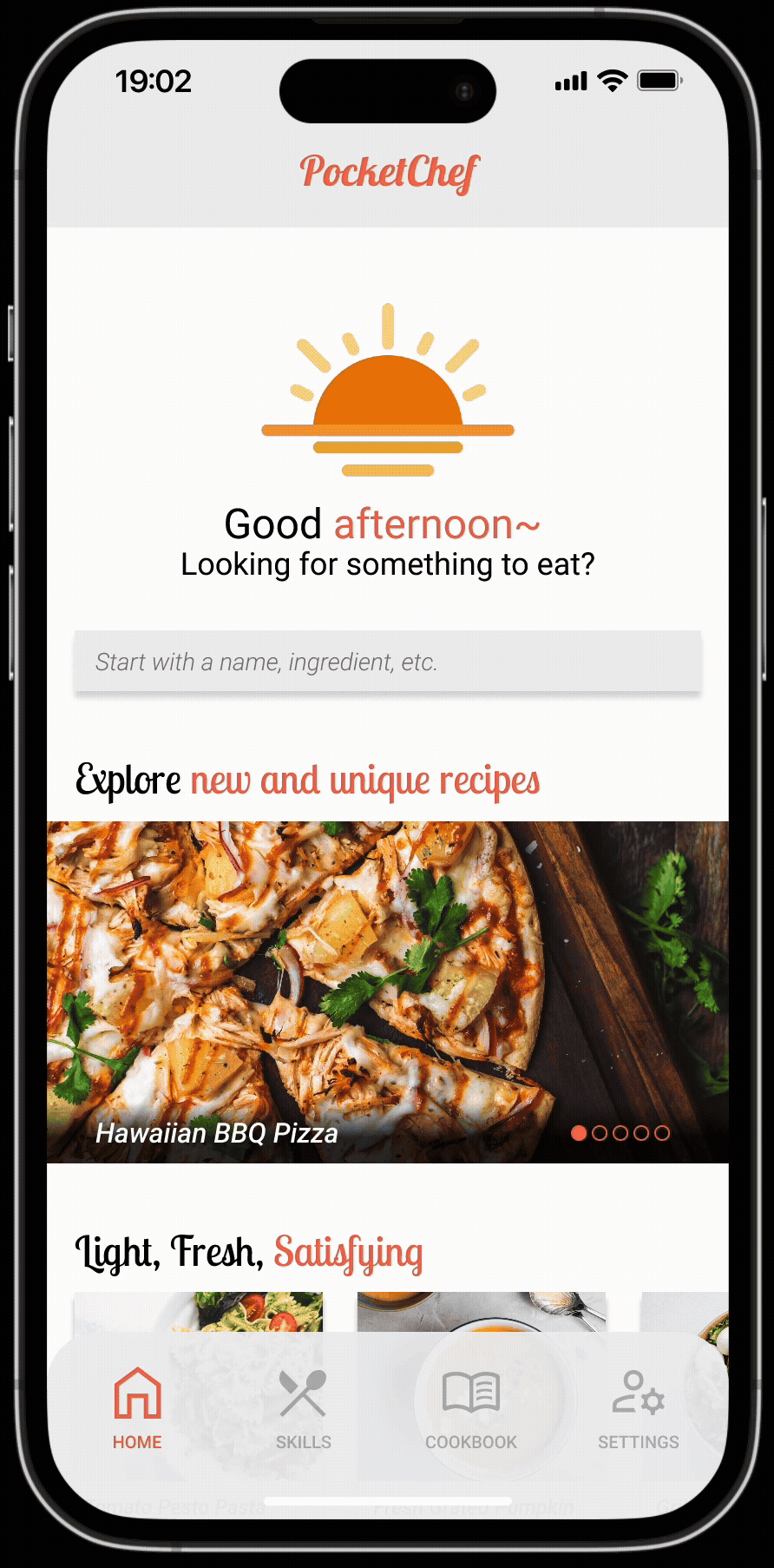
Wireframing and Mockup


Some hours and a stack of papers later, I was able to complete some loose ideas of layouts and features that could positively impact our users and their ability to navigate around the app.
I tested various layouts and combinations to see what felt right, what felt natural, and hope that the end-users would feel the same. After finding happiness in the designs, I moved forward to interactions and higher-fidelity mockups.
I also created the brand logo, sticker sheets, and other assets that would help me streamline the development of the app.

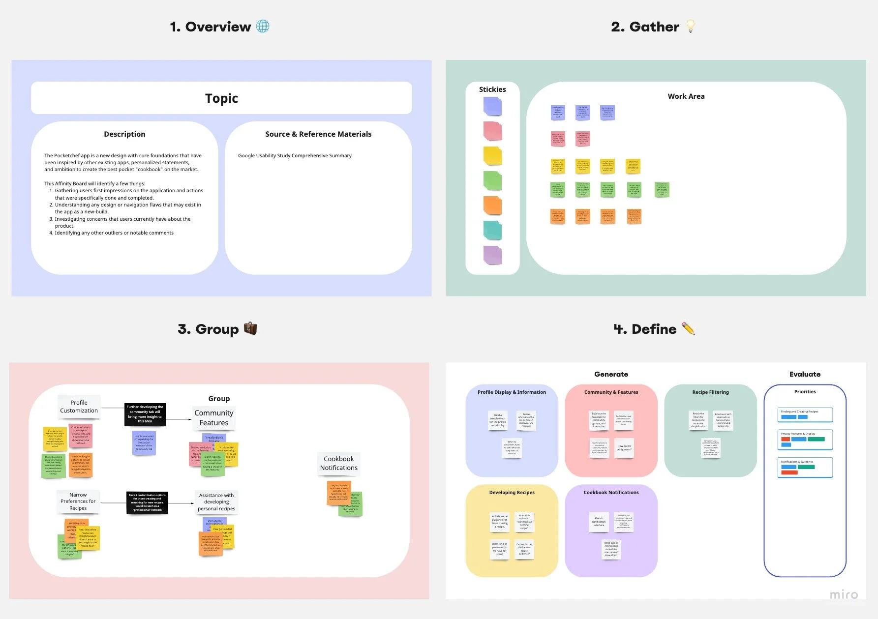
To ensure the direction was clear, I asked for feedback from 20 of my peers in the certification course to evaluate app interaction, information architecture, and navigation. These peers did not take the initial survey which helped highlight insights from a blind test.
I collected user feedback from this space before putting detailed efforts in the high-fidelity mockups and interactions.
Initial Reactions
Prototype
Thanks to the low-fidelity test, I was able to understand where users were getting stuck and what they wanted or saw as a barrier to their interactions. I used this information to develop a journey map and created a navigation I thought would more appeal to the users’ end goal, ensuring that I kept to the three goals we had set earlier in the project: Delicious recipes that are quick and easy to navigate.
I tested the search function and guidance through the recipe with 14 of 20 users who found the app to be easy to navigate and appreciated the layout, with a few users who took the time to make the banana pancake recipe at the end of the interaction.
Results
Successes
User feedback suggested that I achieved a smooth, seamless experience with the goal of the app. There was a reduction in “fluff” in comparison to other cookbook apps and resulted in users cooking the recipe in the demo.
The prototype was distributed to users in unmoderated environments to capture a deeper understanding of natural navigation through the app. Of the 20 users that had tested the app, 14 of them found it to be intuitive without needing additional guidance.
Within this project, I honed my skills in graphic design and branding, allowing me to conceptualize and build a this project from the ground up. The UX-Design process showed me the connection between human-centered design and visual design, which highlighted my strengths and opportunities for future projects.
Challenges & Learnings
Research
I would love to have had more survey results from my initial findings, allowing me to come up with more common themes and insights to act on.
Figma Proficiency
With my first time using Figma, I would have benefitted from a more robust tutorial than the one provided on the course. However, I found additional resources online that helped me become a stronger user in Figma and found great thoughts from other designers on their workflow and organization.
Collaboration
Working independently on the project was challenging creatively. During the course of this project, I felt that my designs and ideas were great, but I missed having some competitive feedback from peers that would allow me to expand on ideas and possibly produce new or different results.